This is another customer-driven update, with lots of improvements you have been asking us for. Keep them coming, and thanks!
Look and feel
You’ll notice some new colors and styling in the application. We have also replaced the Ryver logo in the upper left with your Ryver account name (a popular request). These are just some baby steps on the way to bigger plans we have early in 2016!
In-app and Desktop App alert changes
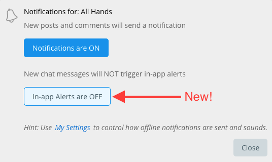
Previously, we only popped up an in-app noty in the lower corner for 1:1 user chat messages, team/forum @mentions, and subscribed post/comment activity. Now, we pop up the in-app noty for any chat message in a pinned tab. This carries over to the desktop app, where we alert you via the tray (Windows) or dock (Mac) icon, and to the sounds if you are on a different browser tab, or have the desktop app minimized.
If you find this too “noisy” for any of your teams/forums, you can turn off these new alerts for individual teams and forums via the Notifications settings.
New action menu for teams and forums
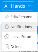
You can now click on the title of a team or forum detail view to get access to actions like edit/rename, subscribe and leave. You no longer have to figure out to go to the PROFILE tab to find these things. 🙂
Improved Settings
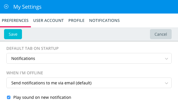
We have simplified the menu when you click on your username at the bottom of the navigation bar. Instead of having to decide between My Profile and My Settings, just click My Settings, where we have combined Preferences, User Account, User Profile, and Notification Settings.
Administrators get a separate settings area for the Ryver account as well. Currently, it only contains the User Manager, but we have more Admin prefs/settings coming soon!
Clickable Hashtags
Hashtags in a Post body, Comment or Chat Message will now show up as blue, clickable links. Clicking on one will open global search for that hashtag, so that you can quickly find other related content.
Chat Edit
In addition to being able to click the up arrow to edit your last chat message, you can now also click cancel to get out of edit mode and back to the new chat text box.
Chat Room presence panel
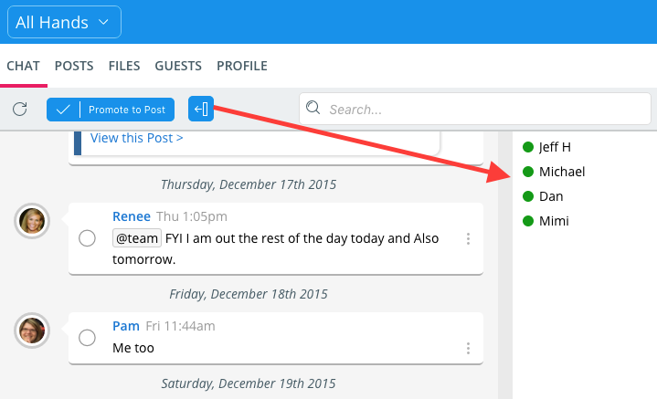
There is now a panel that you can show/hide in chat rooms showing the users who are present. You can click a user to pop up a card showing a mini-profile view.
Auto-complete improvements
- Faster auto-complete for @mentions
- @here and @team included in auto-complete list
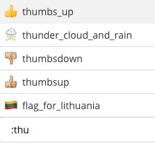
- Auto-complete support for emoticons: Type : or ( plus two or more letters and we’ll display any matching emoticons by name.
Updated Desktop Apps (v1.1.3)
- Better Add Account dialog with validation of the “Account” field.
- Spell checker enabled. No auto-correct, but you’ll see the red misspelling indicator.
- Zoom hotkeys enabled like in the browser: Ctrl +, Ctrl -, Ctrl 0 in Windows, Cmd key for Mac.
- Hot keys for switching between accounts: Ctrl n for Windows, Cmd n for Mac, with n being the ordered location of the account in the account switcher bar.
- Cmd + H hotkey to hide the app.
Introducing Eddy Bot
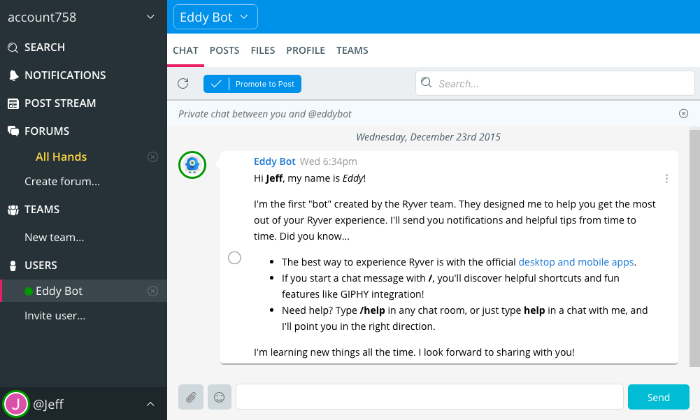
Starting with this upgrade, when you invite new users to your Ryver account, Eddy Bot will introduce itself shortly after they sign in for the first time:
Eddy is available for providing help, and will be picking up new functionality on a regular basis moving forward. Just type /help in any chat room, and Eddy will send you a 1:1 user message in response. You can also ask for help for a particular topic. For example, if you type /help posts, Eddy will send you the following message:

