New look, same great functionality!
Update: We have made the dark navigation bar with light theme option available again. Details at the bottom of this article.
We have made a number of changes to the look and feel of Ryver! For those of you who are curious about this, we want to explain why we made these particular changes…
Overall, customer feedback on Ryver has been great so far. We get a lot of praise for providing threaded Topic conversations and Task Boards, so that important work doesn’t get lost in random chat discussions. However, some customers have expressed concern that the added functionality can be confusing for new users. We spent some time evaluating this problem, and talking to a lot of customers, and we came up with one key change, from which our other changes have flowed:
Left to right navigation
Up until now, Ryver has had two primary navigation flows mixed together:
- Top to Bottom: We used a blue application header as an “anchor” for the application, extending all the way across the top.
- Left to Right: After processing the top header, users would then look at the left navigation bar to select what content they want to view. From there, they go to the right to view the content. However, some important UI elements for your teams, forums and users was also up in that top blue header. Often, new users would miss the fact that there were chat, topics and tasks tabs for their team up in that header.
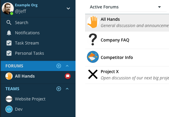
Now, we are using the left navigation bar as an the anchor, with one directional flow:
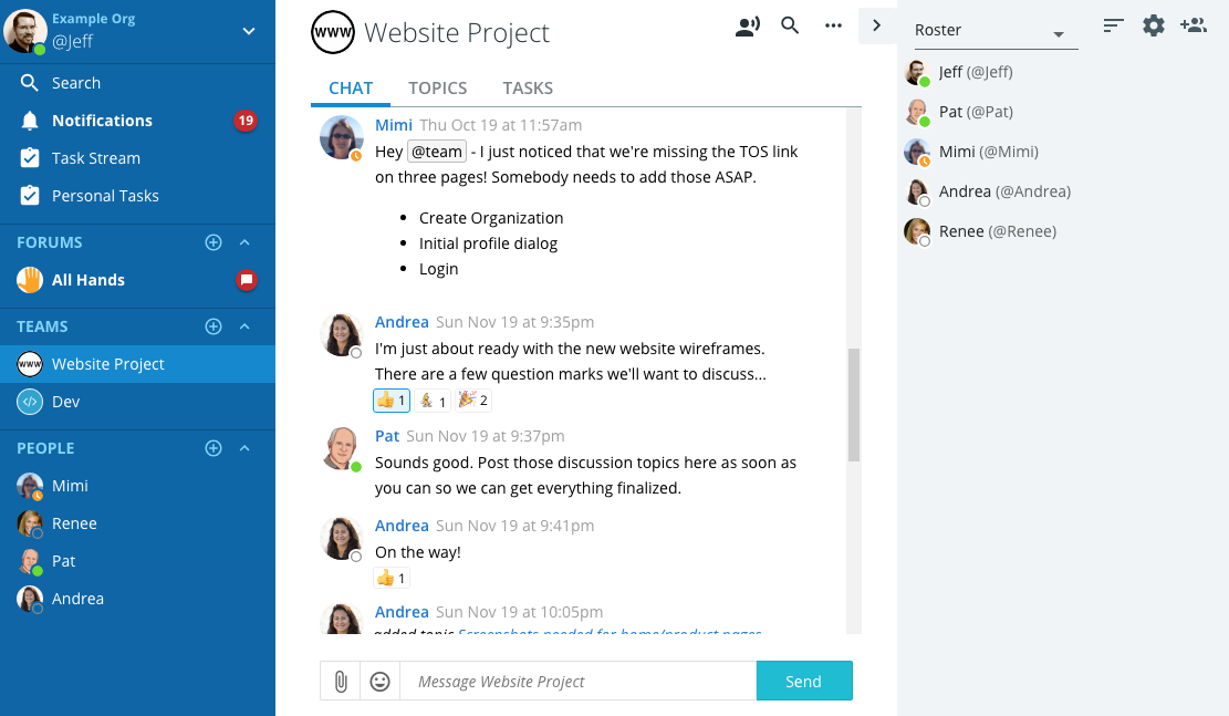
Key things to note:
- The top header is gone, turning the left navigation bar into the anchor for the application. You start on the left and choose the content you want to view.
- Within your content space, everything is clearly related.
- The Team name anchors your content space.
- The action icons to the right of the name look like they are related to the team.
- The CHAT, TOPICS, TASKS tabs are much more prominent, as they are no longer “hidden” up in an application-level blue header.
- Finally, you have the collapsible right side bar that contains additional, optional content related to your content area.
- Note the new Arrow tab for quickly expanding/collapsing the side bar.
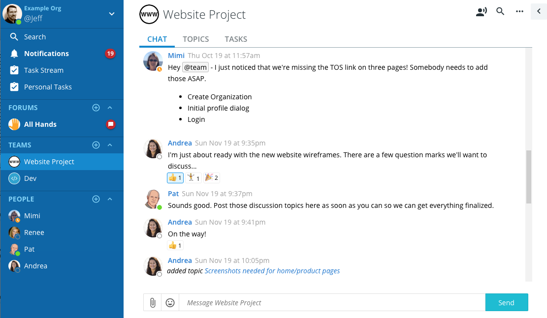
Here it is with the side bar collapsed:
Other notable changes
One menu in the left navigation bar
Another thing that especially confused new users was the fact that we had two menus in the left navigation bar. One at the top for getting help and sending feedback, and another at the bottom for settings, logging out, etc.
Now we have a single menu at the top, which is more consistent with what you will find in other applications.
Administrators: Note that we have changed the name of “Admin Settings” to “Organization Settings”, as these really are settings related to the whole organization, not to you as an Admin user.
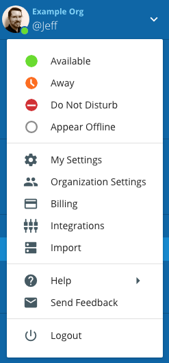
This change might cause some short term frustration for existing users if you are used to going to the bottom to change your availability status or accessing your preferences, but we have found that after a couple of days, the new way feels much more natural. As a bonus, we have moved the Logout option to the furthest menu item from where you open the menu, making it harder to accidentally select.
Left Navigation Bar Changes
We have simplified the naming of the content channel sections from “Open Forums”, “Private Teams” and “Direct Messages” to just Forums, Teams and People.
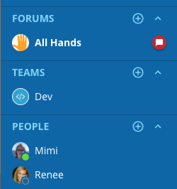
Additionally:
- Avatars: We now show avatars next to the teams and forums if you have added your own Avatar when creating the team/forum, or from Manage Team/Forum.
- Add Buttons: On the FORUMS, TEAMS and PEOPLE tabs, you can still click on the main tab area to open a list of all available forums, teams and users. But there is now also a circle-plus icon to quickly add a new forum/team, or invite a new user to your organization (if you have security rights to perform those actions).
- Collapse: You can expand/collapse sections, which can be convenient if you have a lot of forums or teams, but want to quickly bring your pinned users up into view.
Search is still there!
One side effect of losing the top blue header is that we no longer show the search text box all the time. Functionally, this search has always been local to the team, forum or user you are viewing. It just happened to reside up in that top header bar. Now, you can click on the Search icon in the upper right of your content area, and it will display the search text box and results, which function exactly the same as before.
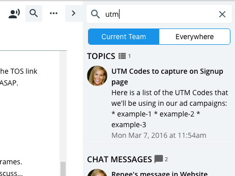
It’s actually the same number of clicks as it was before. When you click on the search icon, we automatically place the cursor in the search text box.
Dark Nav Option
We initially released this update with only “Dark Theme” and “Light Theme”. We got a lot of requests to bring back “Dark nav bar with light theme”, so we have done that:
You can access this theme preference by going to My Settings > Preferences > Navigation > RYVER THEME. If you don’t see the “Light with dark navbar” option, please try refreshing your client and then looking again (View > Reload in the desktop client, or just refresh your browser tab).