Important Announcement
We performed a significant system upgrade on Saturday, July 23, 2016. For this one-time upgrade process, you will need to log back in to your Ryver account, even if you had chosen “remember me” when logging in previously. When you log back in, you will see some significant changes to the UI, which are described below.
This is a one-time conversion of some of our systems that will allow us to continue our rapid growth indefinitely, and to roll out continuous updates in a timely and seamless manner moving forward. We appreciate your patience and understanding for this process.
Note for API users: Due to a switch from single-tenant to multi-tenant DB design for a portion of our data (chat was already multi-tenant), IDs for Users, Forums and Teams have been changed. We will automatically redirect requests to the old IDs, but you may need to add support for that. Also, if you are using the Invite API and specifying teams/forums for people to be added to, those IDs will need to be changed. Apologies for the inconvenience of this one-time change! Please note that Zapier integrations should continue to work, as they will handle the redirect.
July 26 Update
- No longer showing deactivated users in DIRECT MESSAGES
- Fixed bug where you couldn’t edit a chat message twice in a row
- Fixed issue in “mobile mode” with not being able to select a Forum if OPEN FORUMS is your default tab. The fix for mobile client users will require a pending mobile update on the app stores.
- Cleaned up some minor display issues and button/text alignments
- Fixed issue where HTML in team, forum and user display names was being shown in the header bar, which can be a security risk.
Changes in July 23 upgrade
We have had many requests, especially from Admins trying to get their team to start using Ryver, to cut down on the “clutter” and “noise” in the Ryver UI. This update addresses a number of specific things that have been brought up, and we have more on the way.
Single header bar in place of three headers: The combination of Title bar, tabs and toolbar can be disorienting and distracting when you just want to focus on content. We have collapsed those three bars down into a single header containing key information, navigation and access to “actions”.
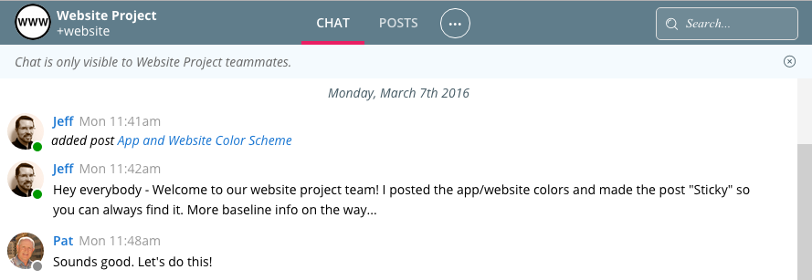
- The header now shows the avatar and nickname for teams and forums. Note that the nickname can be used with a + in front of it to reference a forum/team and provide a link in chat rooms.
- CHAT and POSTS show as tabs in the main content area for Forums, Teams and Direct Messages. Files, Teammates, Profile are now under the ellipses button and show up in a side panel, leaving Chat/Posts always visible.
- Additional actions for the currently selected Team/Forum/User, as well as actions for the selected tab such as POST or CHAT, are located under the ellipses button in the header bar.
Post and Comment Actions “hidden” while reading content: Post and Comment actions now show in a pop-up toolbar on hover (ellipses button on mobile), so that focus is on reading content, and then getting to the actions when you need them.
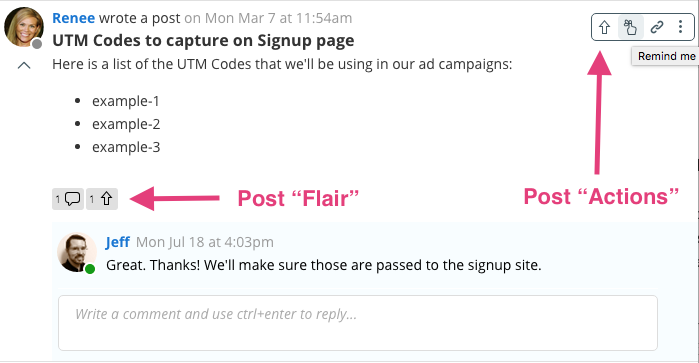
- The Post Actions toolbar is displayed when you hover your cursor anywhere in the post header or content area.
- Post Flair is a set of icons that are displayed below a post to show things like number of comments and up-votes, and whether or not you are subscribed to notifications for that post.
- Comment Actions work just like Post Actions and Chat, where hovering the cursor over a comment will pop up the corresponding action toolbar.
- Note that we have added a light blue background in the comments area to better distinguish it from the post content.
Additional Styling Changes
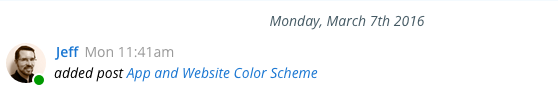
Chat message styling: Embedded previews got a makeover and use much more subtle styling. We also modified the appearance of our auto-generated chat messages when a new post is added. The goal of this message is to alert users in chat that the new post is there. Previously, customers told us that it looked like the post was being placed in both the CHAT and POSTS tabs.
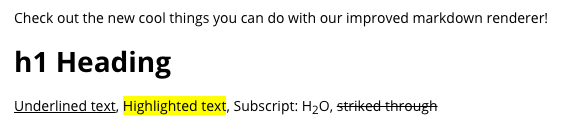
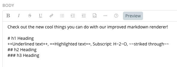
Better markdown formatting: Multiple new markdown formatting options are available, and there is improved handling of numbered bullet points.
Simplified Post Editor: We got rid of the multiple sub-tabs for writing, help and preview. Now there is a single view, with the markdown toolbar always visible, and help/preview available in the toolbar.
Admin Settings
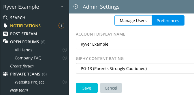
We added a Preferences tab in Admin Settings where you can set the “Display Name” for your account (shows at the top of the nav bar), and set the Giphy rating for your account (the default is PG-13).
Additional usability and performance improvements
- We added additional tolerance for brief network outages. We will retry connecting multiple times over a few seconds, without popping up any irritating bubbles, rather than immediately starting a count-down and waiting to reconnect.
- Note: The new iOS client should do a much better job of reconnecting immediately after the application has been backgrounded for a short time.
- Chat messages are saved locally every 10 seconds while you type them. If a disconnect causes a refresh of your chat room, we’ll grab the latest draft of your message so you don’t lose it.
- You now have more control over the duration for reminders. We will remember your last setting.
- Clicking Create forum or New team in the nav bar will now open a proper dialog that you can close/cancel, rather than showing the static views that just offered a “clear” option.
- Embedded previews for “rich” content such as YouTube videos and SoundCloud audio use much less memory now. A simple image is embedded until you click on it, which loads the more memory and processor intensive “player”.
- When you view the list of forums or teams from OPEN FORUMS or PRIVATE TEAMS, clicking on a forum or team will automatically open and pin it, rather than slide it in as an additional pane. There is also an ellipses button if you want to just view the profile card or pin it and stay in the list.